


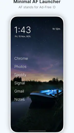
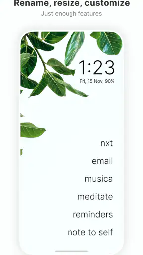
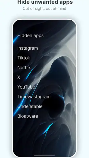
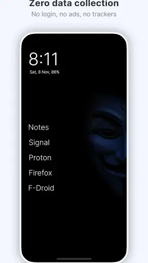
My first impression of Olauncher was almost comically simple: after installation, there was far less competing for my attention. Instead of a busy grid of colorful icons, the home screen puts text and restraint first. That sounds like a small visual change, but it alters the way I reach for my phone. I have to decide what I want to open rather than automatically scanning a familiar wall of icons.
This is a free personalization app from Digital Minimalism, designed for people who want their Android phone to feel quieter. It is available to everyone, works from Android 7.0 onward, and the current release is v6.7.1. Its appeal is not that it adds more tools to a phone; it removes much of the visual invitation to use those tools.
After spending time with it, I think the important question is not whether the minimalist look is attractive during the first afternoon. It is whether the launcher remains useful once the novelty disappears. In my experience, that depends on whether you want a deliberately plain starting point or whether you rely on visual organization, widgets, and quick access to many apps.
From a striking first week to a calmer daily routine
The first week is where the launcher makes its strongest argument. A conventional Android home screen encourages recognition: I see an icon, remember a previous habit, and tap it before thinking. Olauncher replaces much of that recognition-based behavior with a text-oriented interface. The result feels closer to a simple menu than a dashboard.
That difference is especially noticeable when I unlock the phone for a vague reason. With a standard launcher, the screen itself can suggest several distractions. Here, the reduced presentation gives me a moment to name the task. Am I checking a message, setting an alarm, looking up an address, or simply looking for stimulation? That pause is the product’s real value, and it is more practical than the phrase “digital minimalism” might initially suggest.
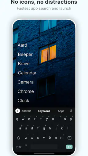
The setup also makes the phone feel less visually dependent on app branding. I do not need to remember where an icon sits in a grid, and I am less likely to confuse two similar icons when I am in a hurry. Searching by name can be quicker for an app I use occasionally, while frequently used apps remain easier to reach once my habits settle.
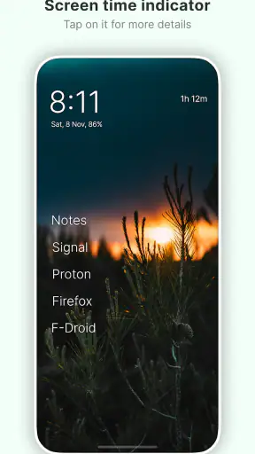
One useful adjustment is to treat the home screen as a short list of intentional destinations rather than a complete inventory. I found that the experience works best when I keep only the apps I genuinely use during the day close at hand. Everything else can remain available through the app list or search. This creates a practical distinction between “available on my phone” and “inviting me from the first screen.”
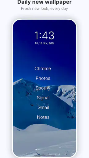
The daily wallpaper option adds a little visual life without turning the launcher into a customization project. I like that balance: the background can change, but the basic interaction remains stable. The wallpaper is not the reason I would install this app, though. If the changing image becomes the main attraction, the deeper benefit of reducing visual noise is easy to miss.
For a realistic example, imagine checking your phone during a work break. On a normal home screen, a social app, video app, shopping app, and news app may all be one tap away. With this launcher, the first screen is less likely to advertise those choices. I can still open them, but I have to make the choice more deliberately. That does not eliminate distraction, and it will not overcome every habit, but it adds useful friction at exactly the point where automatic tapping usually begins.
Why the minimalist presentation works for some people
I would recommend trying it if your problem is not a lack of productivity tools but an excess of easy entry points. The launcher is particularly well suited to someone who already knows which apps matter and wants the phone to stop displaying the rest so prominently.
It can also suit an older Android phone whose default interface feels crowded or sluggish, although I would not assume that changing the launcher alone will transform performance. The main improvement is mental and visual: the phone appears less like a collection of opportunities and more like a utility.
There is a subtle benefit for people who frequently reorganize icons and folders. Olauncher makes that maintenance less central. Instead of continually deciding where every app belongs, I can keep a small group of important destinations visible and rely on text access for the rest. That reduces the temptation to treat the home screen as a personal filing cabinet.
Still, the first-week appeal can be misleading. Minimal interfaces often feel refreshing because they are new. The more important test is whether the reduced layout continues to help after I stop noticing it. In my case, it did when I used the launcher as a boundary around phone use, not as a decorative theme.
What remains valuable after the novelty fades
Olauncher has reached over a million installs and holds an average rating of 4.8 from around eighty thousand ratings, which suggests that the basic idea resonates with a substantial audience. Those figures do not decide whether it belongs on your phone, but they do indicate that the minimalist approach is more than a brief visual trend.
For long-term use, the strongest feature is consistency. A busy launcher can gradually become busy again as new apps arrive, folders change, and widgets accumulate. A deliberately sparse launcher makes that drift more noticeable. When the home screen starts feeling crowded, I know I have added more than I need rather than simply accepting the clutter as normal.
The recurring value also comes from changing the relationship between frequency and visibility. An app does not have to be visible because I use it once a week. That is a useful distinction for banking, travel, delivery, document, or account-management apps. I still want access to them, but I do not need their icons staring at me every time I unlock the phone.
Another practical strength is that the launcher can support a gradual reduction rather than an extreme digital detox. I do not have to delete social media or abandon messaging. I can keep the services I need while making them less visually dominant. That makes the approach easier to maintain than a dramatic all-or-nothing reset.
There is also value in using it during specific periods of life. Someone preparing for exams, working from home, caring for a child, or trying to protect evenings from endless scrolling may appreciate a home screen that does not constantly present entertainment. The launcher is not limited to one permanent lifestyle choice; it can be a calmer operating layer for a demanding season.
At the same time, I would not confuse reduced temptation with control. If you already open an app by muscle memory, a minimalist screen may only add a brief delay. The launcher works best alongside a personal rule, such as checking social apps at chosen times or keeping entertainment out of the first-screen list. The software creates the pause, but the habit still belongs to you.
Where the maintenance is easy, and where it is not
The main maintenance advantage is that there is less to arrange. I do not spend time aligning icons, rebuilding folders, or deciding which widget deserves space. That is a meaningful saving for anyone who likes a clean phone but dislikes constantly cleaning it.
However, minimalism does not mean zero decisions. I still have to choose which apps should be immediately available, how much text I want on the home screen, and whether my chosen arrangement reflects my actual routines. If I keep adding exceptions, the launcher can lose its purpose. A short, intentional list is easier to live with than a long list that merely replaces an icon grid.
My practical advice is to review the visible apps after a week, not every day. During initial setup, I might include too many apps because I am afraid of losing convenience. After several days, usage becomes clearer. Apps that I opened only because they were visible can move out of the primary view, while genuinely useful tools can stay. This makes the launcher evolve around real behavior rather than imagined needs.
Another useful workflow is to separate urgent communication from optional browsing. Keep the services needed for work, family, navigation, or safety easy to reach, but do not give every entertainment app equal status. That approach avoids the common mistake of making the phone inconvenient in the name of discipline.
The free price is important here because experimentation carries little financial risk. I can test the layout, live with it, and return to another launcher if it does not suit me. The app’s age rating of Everyone also makes its presentation broadly approachable, though the usefulness of the experience still depends on the user’s preferences and routines.
Sources of fatigue after extended use
The same simplicity that makes the launcher attractive can become tiring. I sometimes miss the instant visual recognition of a familiar icon, especially when I am moving quickly between several apps. Text is clear, but it can require more deliberate reading than a well-organized grid.
People who depend on widgets should think carefully before switching. Weather, calendar, task, music, smart-home, and fitness information can be useful precisely because it is visible without opening an app. A minimalist launcher may feel like a step backward if your home screen is an active information panel rather than a source of distraction.
It is also not the ideal choice for users who manage many work accounts or large collections of specialized apps. Search and text access can reduce clutter, but they do not remove the cognitive work of remembering app names. If you regularly need to compare several tools at once, folders and visual grouping may be faster.
There is a social and practical downside to making the phone look extremely plain. Someone borrowing the device may not immediately understand where familiar functions are. I would not call that a serious flaw, but it is worth considering in a household where other people occasionally need to use your phone.
The launcher can also expose an uncomfortable truth: if the habit is strong, the interface alone may not be enough. A person who searches for a distracting app every few minutes may simply replace icon tapping with name searching. In that situation, a launcher with stronger blocking or scheduling controls may be a better fit. Olauncher’s strength is the calm starting point, not a complete behavior-management system.
Compared with a typical manufacturer launcher, this app offers a much more opinionated experience. The default option is usually better for widgets, visual customization, folders, and quick access to a large app collection. Olauncher is better when the default screen itself has become part of the problem.
Compared with heavily customizable minimalist launchers, its appeal is restraint. A feature-rich alternative may let me reproduce the same sparse appearance while retaining more control, but that flexibility can bring back the endless tweaking that minimalism was supposed to reduce. I would choose Olauncher for a ready-made change in behavior, and a customizable alternative for a carefully engineered personal dashboard.
Who should install it and who should skip it
I think it is a strong match for someone who unlocks the phone without a clear purpose, feels overwhelmed by a crowded home screen, or wants a quieter interface without deleting essential apps. It is also worth trying for people who repeatedly reorganize icons and still end up with visual clutter.
I would skip it if your phone is primarily a control center for widgets, smart devices, calendars, media, or complex work routines. I would also hesitate if you strongly prefer visual memory over text search. The switch may create friction without delivering a meaningful reduction in distraction.
It is not a replacement for every kind of digital-wellbeing tool. If you need strict limits, app blocking, detailed usage controls, or family supervision, look for an option built around those functions. Olauncher can support those goals indirectly, but I would not install it expecting enforcement.
Before committing, I would take a screenshot of the current home screen and note which functions I use most often. Then I would recreate only the essentials in the minimalist layout and use it through a normal week, including workdays and weekends. That test reveals more than judging the design for ten minutes because it shows whether the reduced access is calming or merely inconvenient.
My long-term verdict
After the initial novelty fades, Olauncher earns its place when I treat it as a habit-shaping environment rather than a visual theme. Its lasting contribution is the quiet separation between what my phone can do and what it constantly encourages me to do. That distinction is small, but it can change the rhythm of repeated unlocking.
The app is free, the current version is v6.7.1, and Digital Minimalism has built a focused experience instead of trying to turn the launcher into an all-purpose toolbox. I appreciate that clarity. There is no need to learn a complicated system before finding out whether a simpler phone suits me.
My recommendation is therefore conditional but positive: try it if your default launcher feels like an invitation to wander. Give it enough time to pass the first-week excitement, keep only the destinations that support your real routines, and judge it by whether you reach for the phone more intentionally. If you need widgets, dense visual organization, or firm usage controls, another launcher will serve you better. For everyone else, this is one of the more convincing ways to make an Android phone feel like a tool again.


